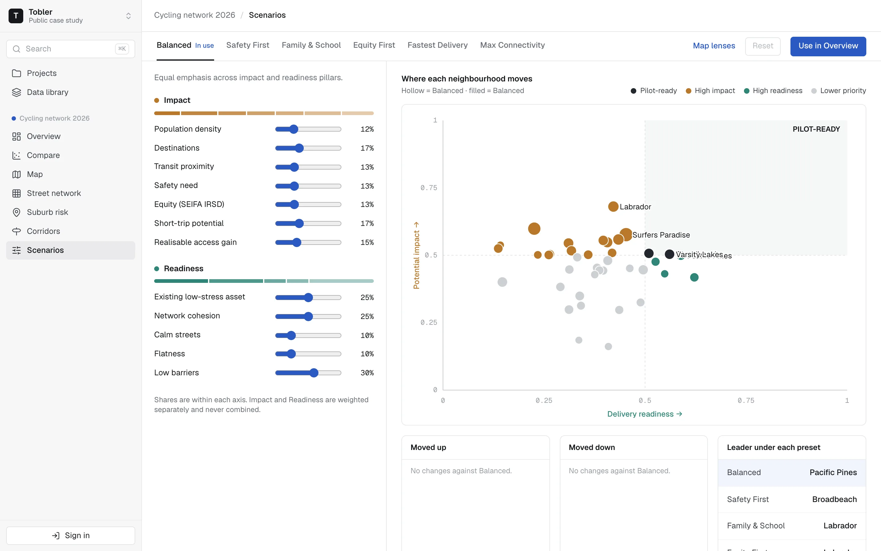
Every council has a network plan. Few can show why one corridor comes first.
Tobler reads your road network, scores each corridor on the factors your council cares about, and ranks them. Today it answers one question well: where your bike grid should grow next, and how good it is now.
A digital twin of your network
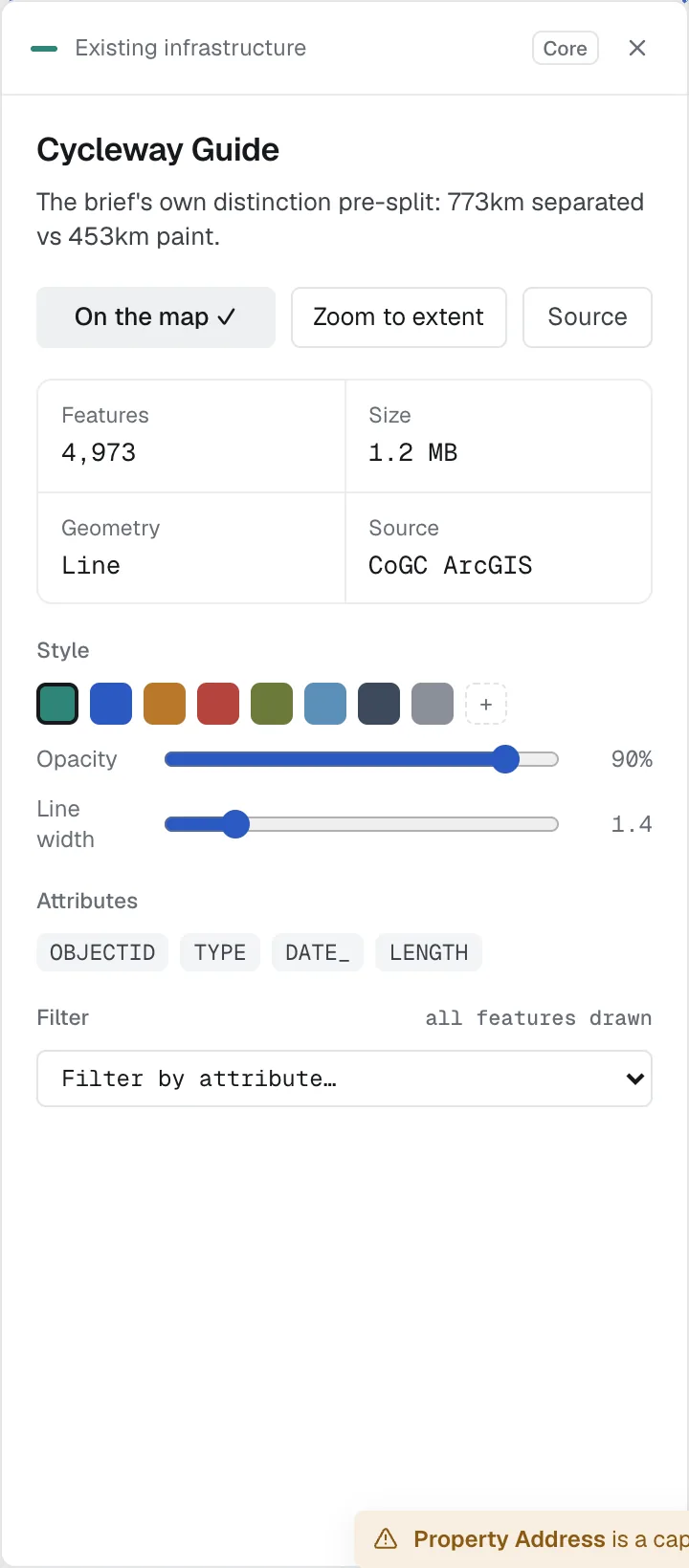
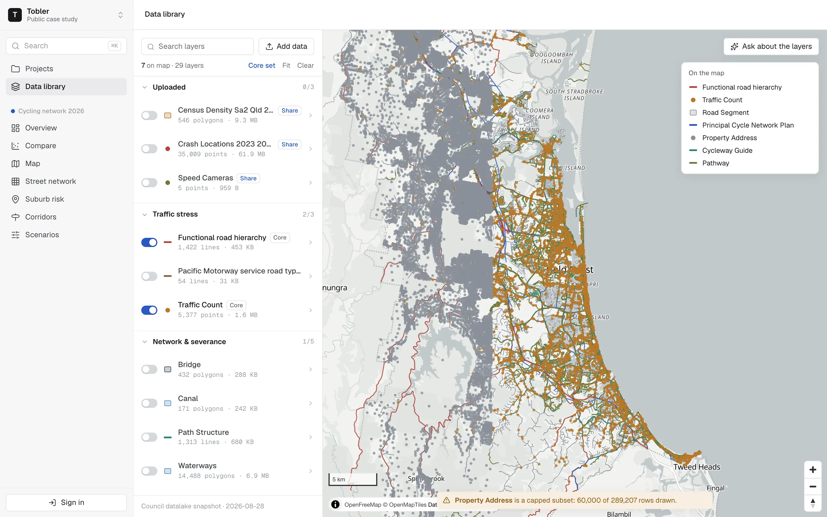
Your shapefiles, portal feeds and databases become one 2D model of the road network, with every street, speed, facility and crash in one place. Each layer keeps its snapshot date.
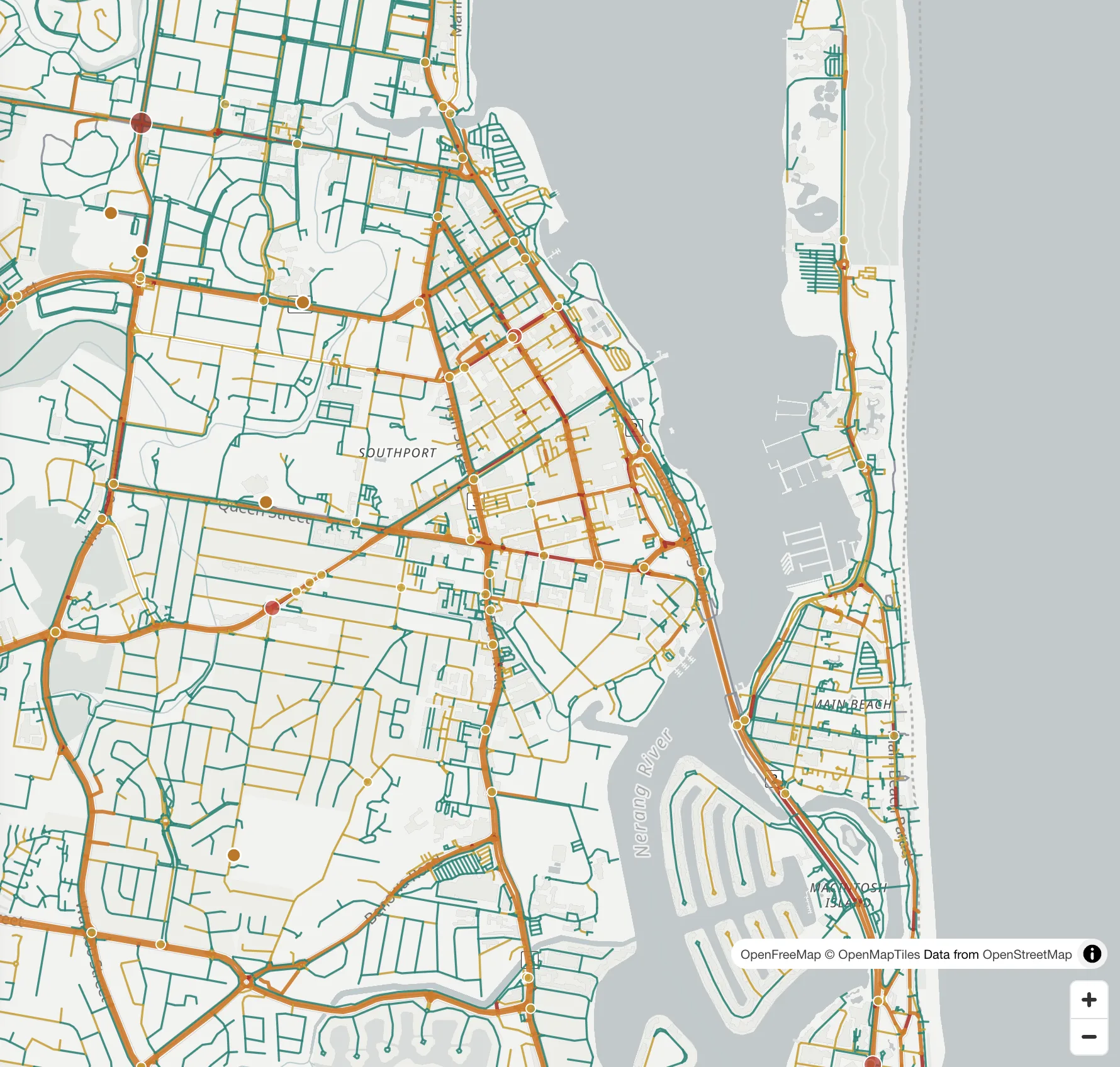
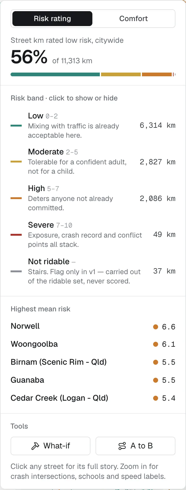
Every street, on the same scale
Speed, hierarchy and facility give every segment a cycling risk band, an LTS-informed proxy. Where data is missing, the segment is flagged, not guessed.
Your terms, in the open
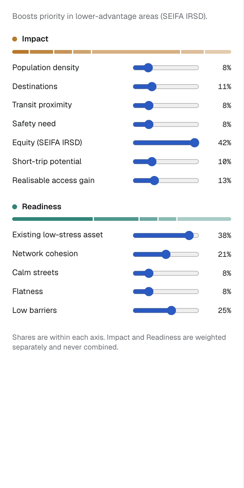
You set the weights, and Tobler shows every indicator and how much it contributed. When someone asks "why this one?", the answer is on screen.
HOW IT WORKS
From a ranked shortlist to the streets that fix it.
Two short recordings of the Gold Coast case study, the same app you get.
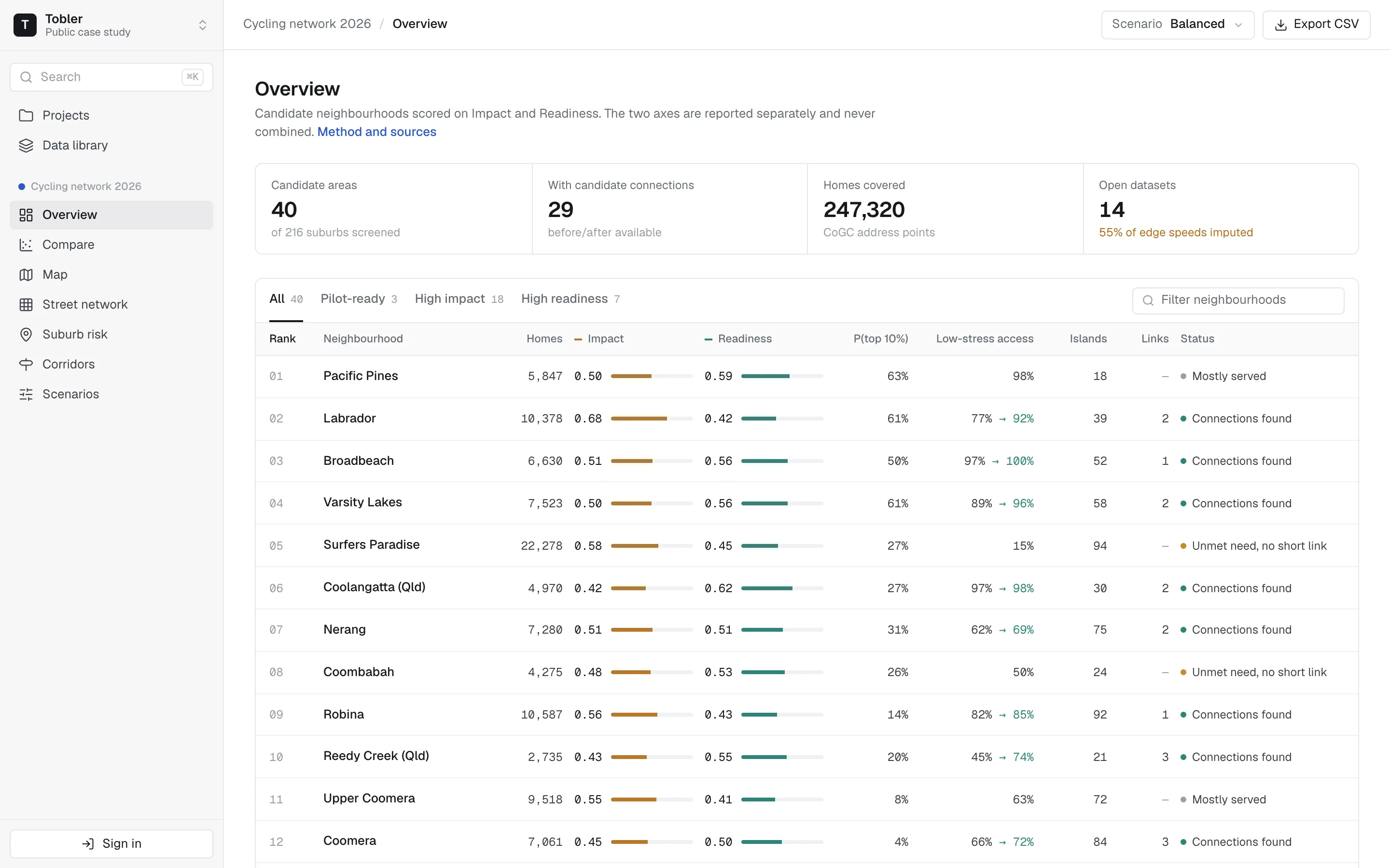
Rank every candidate, on two axes
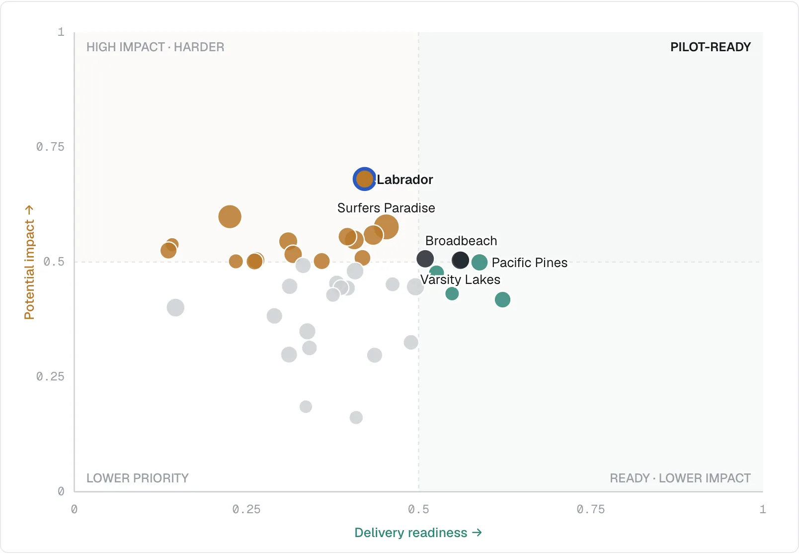
Candidate neighbourhoods scored on Impact and Readiness, side by side and never added together. Filter to the pilot-ready areas, then see them on the impact–readiness quadrant.
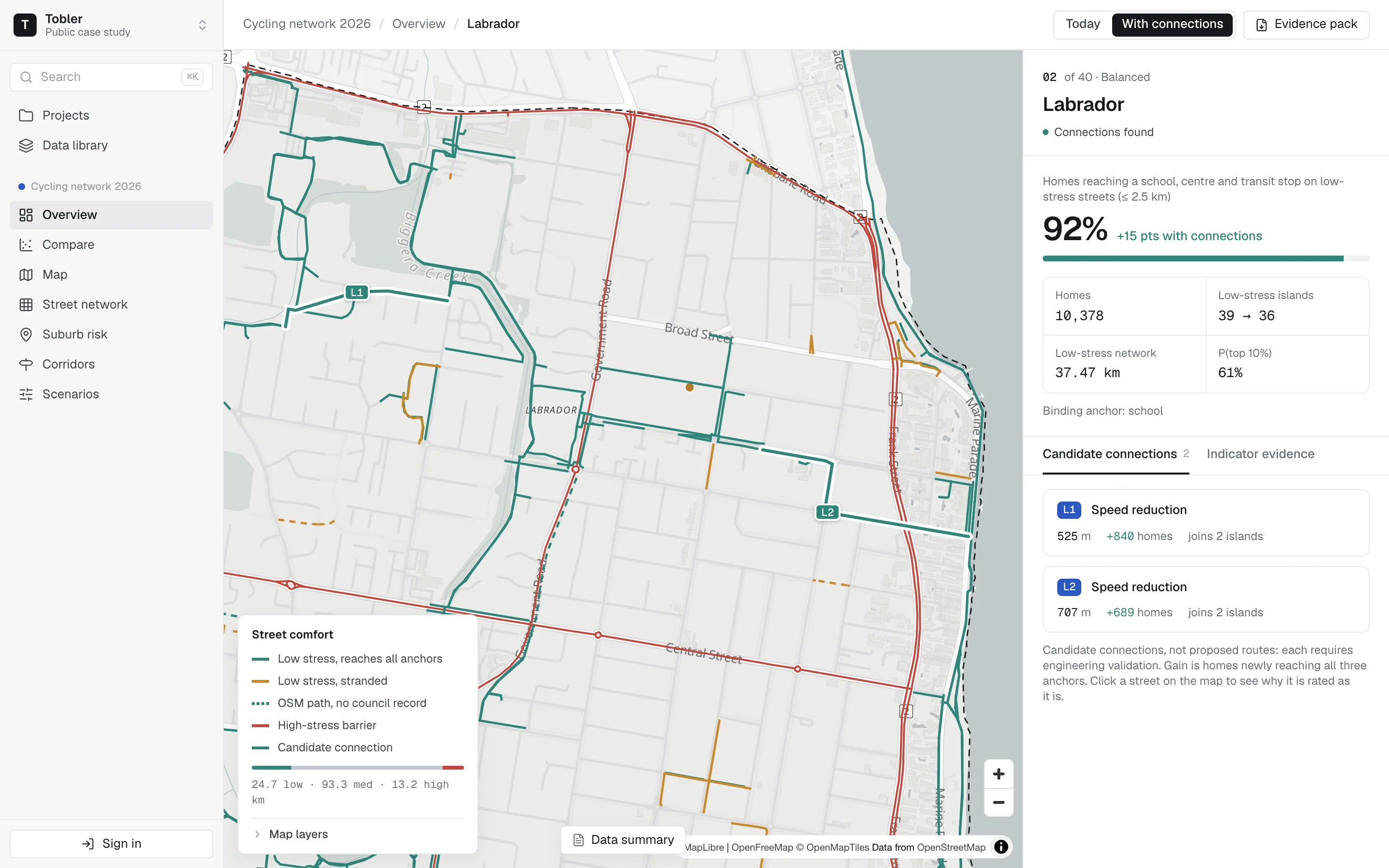
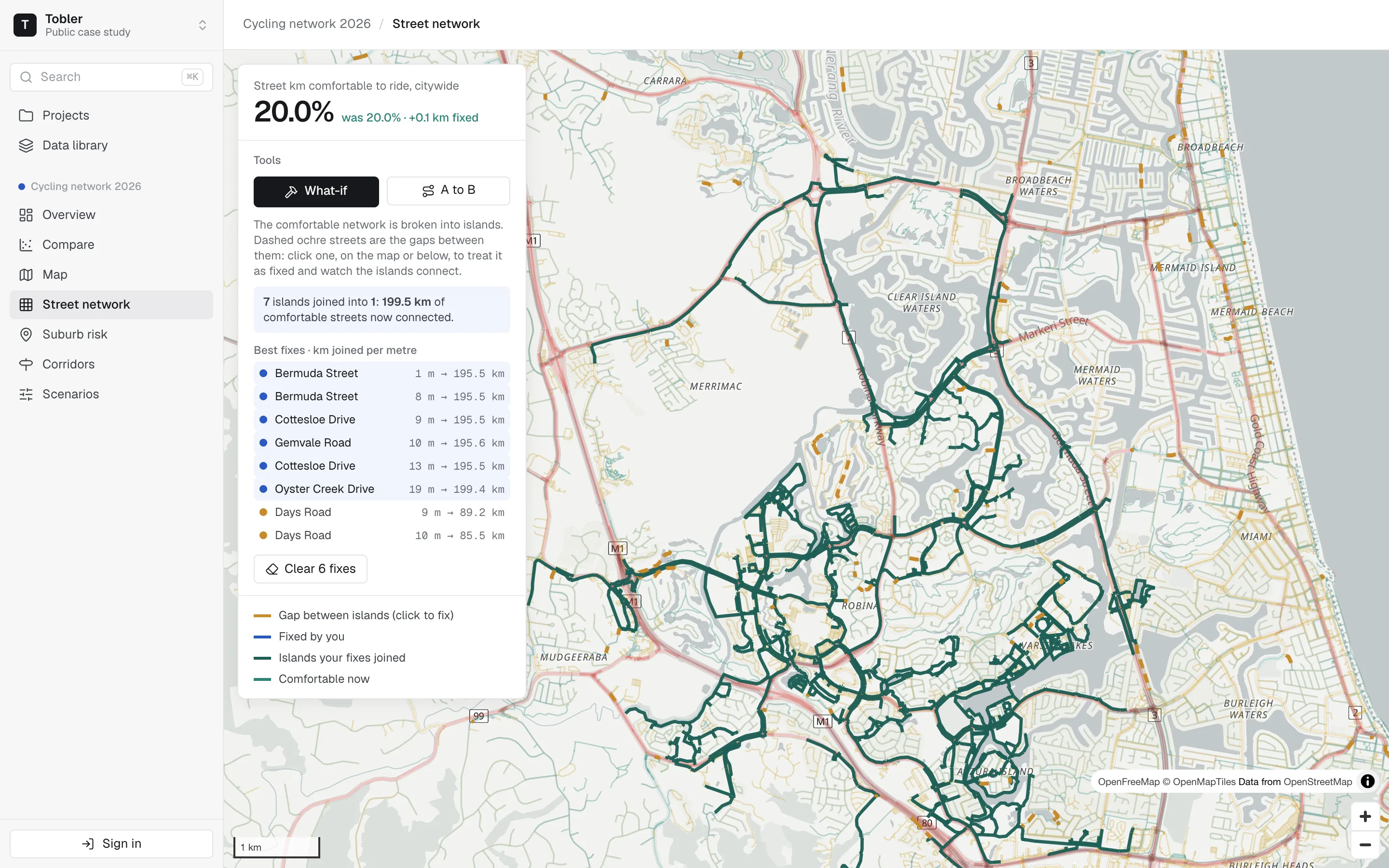
See where the network breaks, and what joins it
Every street carries a cycling risk band. Open a neighbourhood to see its low-stress islands, the candidate connections that would join them, and how many more homes reach a school, centre and stop.
Map data © OpenStreetMap contributors (ODbL), © OpenMapTiles, OpenFreeMap. Street network derived from OpenStreetMap.
PRODUCT TOUR
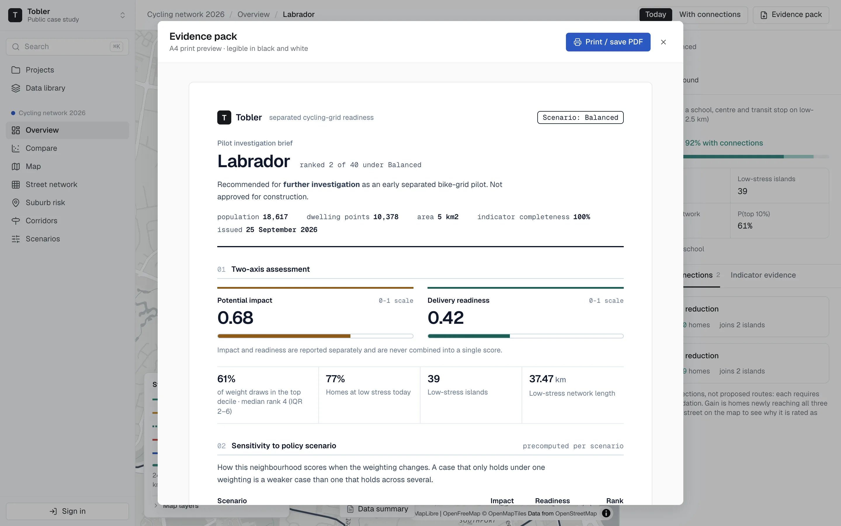
One workspace, from the first file to a brief you can hand over.
01 / 03
Rank every candidate, on two axes
Candidate neighbourhoods are scored on Impact and Readiness, reported side by side and never merged. You can filter to pilot-ready areas, or export the table in one click.
WORKS WITH
The files and feeds you already have.
Any projection. Each layer keeps its snapshot date.
WHO IT'S FOR